This morning I am linking to an article on my husband’s architecture here in North Carolina. Dragonfly House was featured today in “Home & Garden” section of The Raleigh News and Observer’s series put together as a collaboration between the Home & Garden section of the paper and the North Carolina State University Design Initiative. The featured architecture was selected by a panel of experts whose mission was to highlight the benefits of good home design and represent the diversity of homes and home renovations of North Carolina architects.
As you can read in the article, as far as we are concerned, all design starts with the site! This house is on a very small lakefront lot in an exclusive golf course community in Wilmington, North Carolina. Only 11-ft. from one neighboring house and 14-ft. from the other, this house was designed to open up to an inner courtyard containing a pool AND look out over a million-dollar view of a beautiful lake complete with a nesting pair of swans, a beautiful golf course setting on the far side, and a sun-setting western exposure. Once inside this house, you would never even know you had a neighbor!
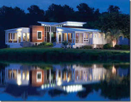
Here are a few photographs of the house, although some are not the best. Here is the money shot of the home on it’s lake setting.
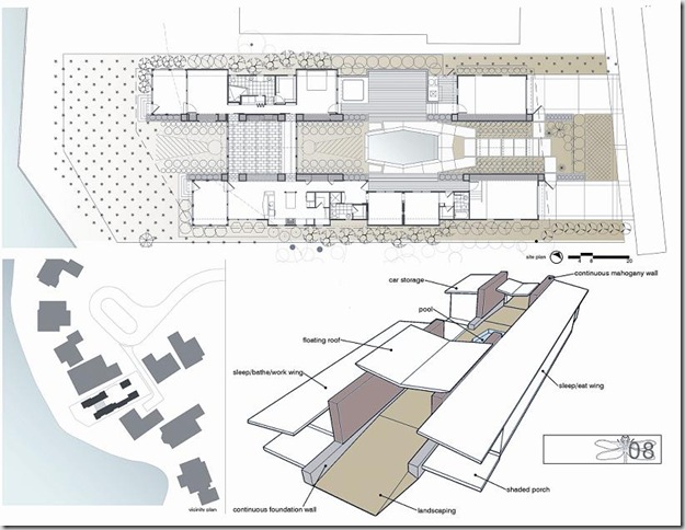
Here is the site plan showing the house on its lot and the floorplan:
On the lower left, you can see the house situated among it’s neighbors. While the Dragonfly house is oriented for views to its interior courtyard and the lake, the other houses are typical box-type houses with windows peering into each others kitchens, living areas and bedrooms.
This is a view when entering the home through the courtyard gates. The main family/living room straight ahead has all glass curtain walls looking into the interior courtyard on one side and out over the lake on the other side.
Here is a view of the kitchen from the dining area that really does not show you too much. The floors are Brazilian cherry and the cabinetry and bar is Anegre wood with Absolute Black granite tops. The fashionable bar stools are designer stools called “Baba Bar Stools.” Sorry for the poor quality photographs.

This is a view of the large family/living room looking toward the kitchen/dining area. To the right is the wall of glass that looks out over the lake. The walls in this room are mahogany again with Brazilian Cherry floors and anegre wood built-ins. The blue wall at the end of the stair axis to the left of the photograph contains a beautiful stained-glass piece designed and built by the owner of the house.
Who is the architect you ask? Michael Ross Kersting. Visit his website at Kersting Architecture.
This week I’m hooked on modern architecture. To see what others are hooked on, visit Hooked on Houses Friday Blog Party and also Fifi Flowers Fashionable Fridays.


What I've learned is to let a pro select the lot, the house to renovate, the house to tear down, the house that will appreciate fastest. The earlier the architect is in on the process the better things will turn out. They have all the 1000's practical issues in their head already. And they aren't so emotional about it.
ReplyDelete(I'd guess architects do get a bit more emotional towards the end of a project.)
I like the kitchen picture because of the long hallway to the door. It gives you a zen view.
Floor plan?
The floor plan was published in the paper and not on the web. I have it on autocad but haven't figured out how to convert it to the blog yet. Sorry.
ReplyDeleteWith neighbors that close, a courtyard is the way to go. Beautiful.
ReplyDeleteStunning photo of that house at night! Wow, hey I miss your blog, I just realized I haven't been here in a while!!
ReplyDeleteGorgeous! How fabulous to have that view of the lake--and love the courtyard concept. Really enjoyed this tour. Thanks! :-)
ReplyDeleteAMAZING house! It is quite FASHIONABLE... and yet your site does not link to moi! Will you please add a link back to Fashionable Fridays since you have added a link on my site... Merci Beaucoup... Bon week-end!
ReplyDeleteFifi
Thanks for your comments all. Maria, I'd love to know your thoughts on the colors you see. The house is done very well mostly with subtle colors from the seacoast. Julia, I've added a bit more information for your perusal and Fifi, Certainment! I have added a link to your site! Thanks for visiting!
ReplyDeleteWowza! What a beautifully cool place he designed! Kudos. BIG kudos! Love it!
ReplyDeleteI love this house, and all the thought that was put into designing it. The inner courtyard is a great idea -- it's good to be able to forget how close you are to your neighbours!!
ReplyDeleteLove the wood on the family room walls and ceiling, and the cobalt blue pendant lights in the kitchen. And of course, that setting next to the lake is fantastic!!
Kelly @ DesignTies
sorry to post this as a comment, but I don’t have your email.
ReplyDeleteI am regular visitor of your blog..
Sir i would request to write more about green architecture...
architects as architecural know more about Green eco architectural designs are reusable materials, green designs etc.. ..… Create an Eco friendly Green design… Save Earth.. interior designers Bangalore as of natural materials interior designers in Bangalore with almost modern concepts architects bangalore
aqa