


Photo by Gigapic
Or sculptural.

Gardens are all about color.

Photo by Cheryl Pedemonti
If we can learn how to use color (or not use it) than we can effectively design with color to reinforce our overall design intentions or concept.

Here are the basics. First, we have the color wheel.

Red, Blue and Yellow are the Primary Colors.
 Violet, Orange and Green are the Secondary Colors.

You get Secondary colors by mixing two primary colors together:
Red + Blue = Violet
Blue + Yellow = Green
Yellow + Red = Orange
Complimentary Colors are those colors that are opposite colors on the color wheel. They compliment each other perfectly and provide the most contrast for each other. When combined in a planting, they create high energy and gain the most interest. Complimentary colors are Purple + Yellow ...

Red + Green ...

...and Orange + Blue.

Analogous Colors are those colors that are adjacent to each other on the color wheel. They are similar and go together well, but do not offer the most contrast. They are harmonious colors and create low energy in the garden.
There are warm analogous colors...

and cool ones ...

Photo by Dog of the Forest
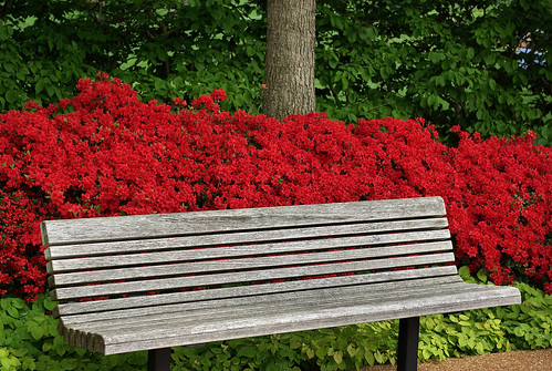
The Warm Colors are Red, Yellow and Orange. They are the loud and bold colors! They appear to advance or jump out at you. Have you ever noticed how when looking at a photograph your eye will see the red color first?

Photo by Perry W 1958
If you want to feature something such as a sculpture, entry way or fountain, put warm or hot-colored plants adjacent to the object you want to feature. The viewer's eye will immediately be drawn to that object.

Photo by serialplantfetishist
In garden design, the warm colors will make a large space appear smaller.

Photo by Carl's Bits of Nature
When used in the background, foreground objects appear larger by contrast.


Photo by Mark Fountain52
When used en masse, objects advance toward the viewer.

Warm colors can make objects seem larger and spaces feel smaller. They also create high energy.

The Cool Colors are Violet, Blue and Green. These colors appear to recede or fade away in the garden. They are the pastels and paler colors and they are low energy and relaxing colors. This photo of the Chanticleer Gardens in Pennsylvania shows good use of cool colors.

Cool colors can make a small space feel larger.

When used in the background, cool colors have little impact on the foreground.

They can make objects feel smaller or appear farther away.

Value is the lightness or darkness of the color. Variations in value are used to create a focal point for the design. The greater the contrast in value, the greater the impact the planting will have.


In garden design, contrast is good if you want to call attention to something.

Photo by Barton's Greenhouse & Nursery, Inc.
Hue is the saturation of color. Primary colors are pure hue. Intensity is the purity of color or amount of pigment.
Color should please the artist and be appropriate for the purpose.

Lynne Tansey
It should also possess unity and offer variety of interest.

Photo by Lauren Wayman

Color can and should be used as linkage in the garden to link two or more spaces together.

It is just one of the threads that can tie the whole design together, thus creating harmony.

Photo by lancasteruk
And unity and harmony should be the goal of every garden designer.
This is fantastic! I've been looking for garden/landscape education opportunities as a possible career path, but there aren't as many options in our area as I'd like; do you have any suggestions?
ReplyDeleteHello TS -- Thank you for your kind words. I'm not sure where you live, but the first place I'd look is at a nearby community college or other college. Look for horticulture classes. Another place to look would be at your local County Extension Service. They might have master gardener classes as well. Good luck!
ReplyDeleteHi! I'm in Charlotte area NC. I've been looking at the community colleges, but I hadn't thought about the extension center; I'll be there this Friday night, so I'll talk to the county agent then. Thanks!
ReplyDeleteHi there Pam:-)
ReplyDeleteGreat posting! Food for thought too especially as the colours will soon start appearing in our gardens with Spring bulbs. Hard to pick a fav pic but the one I could connect to was the linkage one ;-)
I have a small garden with borders as close (and closer) as shown. I don’t link them quite as formally, I more let the colours trickle across with the same plant then pick up other plants with the same colour there… then I moved through to the next border to get a background river of the colour. I do the same with foliage plants especially the grasses. I have fun with it :-D
Where did you find all of these photos? They are amazing.
ReplyDeleteI was thinking of doing a post on color. It's such a personal thing (and of course likes and dislikes change all of the time), and it's fun to see what different gardeners do with color in the garden.
I am an horticultural creative critic from Puerto Rico, USA.
ReplyDeleteSince being critical is in my nature, I declare that after reading/watching hundred of articles,
pictures, I had never seen anything such as this.
A garden should express one's personality, individuality, that is what I aim for.
But this article goes further, since everything
is placed at different contexts: urban, residence, garden, medians etcetera.
Contrasts between color, textures, shape, height
are the elements that make a space unique.
Thanks for such a stimulating, educational, article and photos. Until then...
Thanks for your comments! Sweet Bay, if you click on the photo it will link back to where the photo came from. Most are from flickr. Antigonum Cajan, I am honored that you found my article stimulating and educational! Thank you. I also agree with you completely. Color is just ONE of the elements of garden design. There are many more. Form, line and texture also assist color in creating unity, contrast, harmony, interest, etc. And we will be touching on those topics in future articles!
ReplyDeleteI have to say that if I am in need of beauty or tranquility and am stuck indoors your blog is the first place that I go to. Thank you
ReplyDeleteI gasped when I saw that photo at the top of the post. Beautiful! All of the photos are. I really appreciated this on such a cold, snowy day here.
ReplyDeleteJust adding a comment to link this post to Julia's "Hooked on Fridays" post where you can read what every one is hooked on this week. Here's the link:
ReplyDeletehttp://hookedonhouses.net/2009/01/29/hooked-on-fridays-decorating-books-from-the-50s/#comment-19785
This is a great post with a great collection of photos to illustrate the points made. I think I am most impressed with you're crediting of photos! That is so rarely ever done.
ReplyDeleteHi, Pam. This was a great post esp. since so many of us are planning our spring and summer gardens. I enjoyed the photos so much. The hint about placing warm colors next to an object to draw attention to it was very timely for me. Thanks.
ReplyDeleteJan
Always Growng
This is such a gorgeous post! I adore all the photos you showed! Thank you I enjoyed it very much!
ReplyDeleteHi Pam. I love this post for your guidance and the wonderful photos, but also because as I'm planning garden vignettes, I never remember what colors do what. I'm bookmarking this page so it's always handy and I don't need to rifle through all the gardening books.
ReplyDeleteThanks for your kind words, all! Color Me Happy, I'll take that as a HUGE compliment coming from you -- an expert! I will most definitely be following you as I know there are many more things I can learn from you. Thank you for stopping by.
ReplyDeleteWhat a fantastic post!!! Your photos are inspirational :)
ReplyDeleteWhat lovely photos - makes me dream of spring! Thank you for stopping by :)
ReplyDeleteAre there any plants that
ReplyDeleteyou avoid using for any
subjective, pragmatic reasons?
I do. Any plant that drops
too many seeds, leaves, fronds
are thorny, hard to keep are not
in my inventory.
I believe horticulture has to be
a thing of pleasure, mostly, and
some effort/stamina.
Wonderful post. Loving your blog!!
ReplyDeleteVikki
Gorgeous photos! Wow!
ReplyDeleteHi , I loved your Blog Pam. I am also architect and landscape desing in Brazil, São Paulo. My office calls Nas Quatro Estações or be, Four Seasons. Congratulations I hope to visite it always.
ReplyDelete