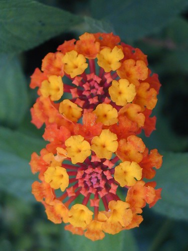
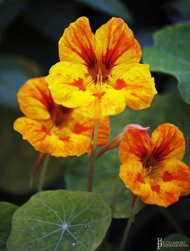
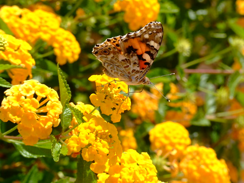
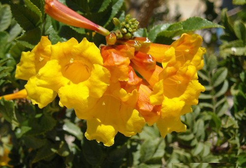
Color is a powerful tool when it comes to garden design.
It can be seasonal.

Photo by GigapicOr sculptural.

Photo by foggy morning
Gardens are all about color.
 Photo by Cheryl Pedemonti
If we can learn how to use color (or not use it) than we can effectively design with color to reinforce our overall design intentions or concept.

Photo by Brenda Anderson
Here are the basics. First, we have the color wheel.

Red, Blue and Yellow are the Primary Colors.
 Violet, Orange and Green are the Secondary Colors.

You get Secondary colors by mixing two primary colors together:
Red + Blue = Violet
Blue + Yellow = Green
Yellow + Red = Orange
Complimentary Colors are those colors that are opposite colors on the color wheel. They compliment each other perfectly and provide the most contrast for each other. When combined in a planting, they create high energy and gain the most interest. Complimentary colors are Purple + Yellow ...

Red + Green ...

Photo by littlegemtrees
...and Orange + Blue.

Analogous Colors are those colors that are adjacent to each other on the color wheel. They are similar and go together well, but do not offer the most contrast. They are harmonious colors and create low energy in the garden.
There are warm analogous colors...

Photo by nor certitude
and cool ones ...
 Photo by Dog of the Forest
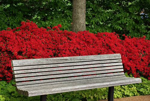
The Warm Colors are Red, Yellow and Orange. They are the loud and bold colors! They appear to advance or jump out at you. Have you ever noticed how when looking at a photograph your eye will see the red color first?
 Photo by Perry W 1958
If you want to feature something such as a sculpture, entry way or fountain, put warm or hot-colored plants adjacent to the object you want to feature. The viewer's eye will immediately be drawn to that object.
 Photo by serialplantfetishist
In garden design, the warm colors will make a large space appear smaller.

Photo by Carl's Bits of Nature
When used in the background, foreground objects appear larger by contrast.

Photo by Wooby 1950

Photo by Mark Fountain52
When used en masse, objects advance toward the viewer.

Photo by Tom Archibald
Warm colors can make objects seem larger and spaces feel smaller. They also create high energy.

Photo by bratjerm
The Cool Colors are Violet, Blue and Green. These colors appear to recede or fade away in the garden. They are the pastels and paler colors and they are low energy and relaxing colors. This photo of the Chanticleer Gardens in Pennsylvania shows good use of cool colors.

Photo by bbbenchetrit
Cool colors can make a small space feel larger.

Photo by Cheryl Pedemonti
When used in the background, cool colors have little impact on the foreground.

Photo by iYaKuu
They can make objects feel smaller or appear farther away.

Photo by Jacki Dee
Value is the lightness or darkness of the color. Variations in value are used to create a focal point for the design. The greater the contrast in value, the greater the impact the planting will have.

Photo by jangosmum

In garden design, contrast is good if you want to call attention to something.

Photo by Barton's Greenhouse & Nursery, Inc.
Hue is the saturation of color. Primary colors are pure hue. Intensity is the purity of color or amount of pigment.
Color should please the artist and be appropriate for the purpose.

Lynne TanseyIt should also possess unity and offer variety of interest.
 Photo by Lauren Wayman

Photo by Goobertron
Color can and should be used as linkage in the garden to link two or more spaces together.

Photo by Crazy.wolf
It is just one of the threads that can tie the whole design together, thus creating harmony.
 Photo by lancasteruk
And unity and harmony should be the goal of every garden designer.